When creating the logo for my project I looked into different apps, companies and other similar projects for inspiration. I knew from the start I wanted to include the O from OptcialSim so there is a connection between the brand name and logo, thankfully, this also looks the same as a pupil so I can incorporate both of these elements in my logo.
Here are a few of my original ideas below.

As you can see in these images the eye is a strong feature of the logo. I wanted to focus on the eye because this is essential what my project revolves around. I decided to further my ideas and also add in an S to the logo. This would then mean that the logo has both the O and S from OpticalSim in it.

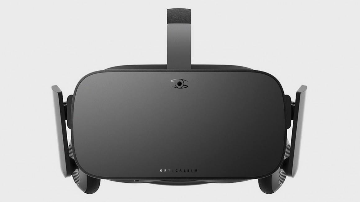
I really like this logo because I feel that it reflects the project and has also been made to look very similar to an eyeball. In addition to the logo I have also created some mock up designs for the headsets with the logo printed on them.